Type as Texture: Advanced Techniques for Tactile Typography in Digital Design
- Sinisa Zec Studio
- No Comments
- Graphic Design, Typography
I see it everywhere. Clean, geometric, sans-serif type on a flat background. It’s legible, sure. It’s also sterile. I think about 90% of brands are marching toward this minimalist void, and in the process, they’ve stripped all the life, all the character, all the *feel* out of their designs.
My career started on the floor of a print shop. I learned design with the smell of ink in the air and the weight of paper stocks in my hands. I saw type debossed into thick card, the physical impression it left. You could feel it. That’s a dimension we’ve almost completely lost on screen. But we can get it back.
This isn’t about just slapping a grunge texture over some letters. This is a masterclass in thinking about type as a physical object that interacts with light and surfaces in a digital space. We’re going to build texture that looks like it belongs, using layers, displacement, and a bit of discipline. Let’s get to work.
Step 1: The Foundation is the Font
You can’t build a textured masterpiece on a weak foundation. Your choice of typeface is the single most important decision you’ll make. A font like Helvetica is engineered for neutrality. Trying to force texture onto it often feels fake, like a bad costume.
Instead, look for typefaces with inherent character:
- Serifs with Substance: Look for fonts with thick, character-rich serifs, slight irregularities, and a human touch. They are already halfway to feeling like a physical object.
- Distressed & Hand-Drawn Fonts: Use these with caution, but a well-made distressed font has texture baked into its DNA. It’s designed to look worn, printed, or stamped.
- Blackletter & Script: These often have thick and thin strokes that react beautifully to light and shadow effects, mimicking ink pooling on paper.
The goal is to choose a typeface that looks like it *wants* to be textured. It gives you a head start and makes the final result more believable.
Step 2: Building Depth with Layers in Photoshop
This is where we move from theory to practice. The key to believable texture is layering. One single effect will always look flat. We need to build depth with multiple, subtle layers that work together. Here’s my typical workflow in Photoshop.
First, set your type. Get the wording, kerning, and leading right before you do anything else. Once you’re happy, convert the type layer to a Smart Object. This is non-negotiable. It keeps your effects non-destructive, so you can always go back and make changes.
Next, start building:
- The Base Color: This is your Smart Object layer. Simple enough.
- The Texture Overlay: Find a high-resolution texture. Scanned paper, concrete, metal rust, fabric—whatever fits the mood. I often shoot my own with my Nikon Z6 III and the Sigma 105mm macro lens to get truly unique, high-fidelity textures. Place this texture on a layer above your type.
- Clipping the Texture: Create a clipping mask so the texture only applies to the letterforms (hold Alt/Option and click between the texture and type layers).
- The Blend Mode: This is where the magic starts. Experiment with blend modes like Multiply, Overlay, Soft Light, or Hard Light. Multiply will darken, Overlay will increase contrast, and Soft Light is more subtle. There is no single ‘right’ answer; the blend mode depends on your texture and your base color.
- Subtle Layer Styles: Now, on the original type Smart Object, add some layer styles. A very subtle `Inner Shadow` can simulate the edges being slightly impressed. An almost invisible `Bevel & Emboss` (using ‘Chisel Hard’ or ‘Chisel Soft’ at a tiny size, like 1-2px) can catch a fake ‘light’ and sell the effect of dimension. The key is subtlety. If you can immediately tell it’s a layer style, you’ve gone too far.
Step 3: Advanced Realism with Displacement Maps
This is the technique that separates the pros from the amateurs. A texture overlay lies flat on top of your letters. A displacement map actually warps and distorts your letterforms based on the light and dark areas of a texture. It makes the type look like it’s truly printed on, or made of, the textured surface.
Here’s how to do it in Photoshop:
- Prepare Your Map: Take your texture image. Desaturate it (Image > Adjustments > Desaturate). You might want to increase the contrast slightly and apply a light Gaussian Blur (maybe 1-2px) to smooth it out. Save this new grayscale image as a separate PSD file. This is your displacement map.
- Apply the Filter: Go back to your main document. Select your type Smart Object layer. Go to Filter > Distort > Displace.
- Set the Values: A dialog box will appear. The Horizontal and Vertical Scale values determine how intense the effect is. Start low, with values around 3 to 5. Higher numbers create more extreme distortion. Select ‘Stretch to Fit’ and ‘Repeat Edge Pixels’.
- Choose the Map: After you click OK, Photoshop will ask you to select your displacement map file. Choose the PSD you saved in step 1.
You will see your type bend and warp realistically around the contours of the texture. It’s no longer sitting on top of the surface; it’s part of it. This one filter adds an incredible amount of realism.
Step 4: Vector Texture in Illustrator
Don’t think this is just a raster game. Illustrator’s Appearance panel is an absolute powerhouse for creating non-destructive, scalable textured type.
Set your type in Illustrator. Open the Appearance panel (Window > Appearance). This panel lets you stack multiple fills, strokes, and effects onto a single object.
Try this: add a second Fill to your type in the Appearance panel. Select this new fill and drag it below the original character fill. Now you can apply effects to just this lower fill. Go to Effect > Distort &Transform > Transform and offset this lower fill by a few pixels down and to the right to create a ‘drop shadow’ effect. But instead of a shadow, fill it with a textured swatch or a gradient.
You can also use Opacity Masks with vector grunge elements to ‘erase’ parts of your type non-destructively. It’s a different workflow, but just as powerful for creating designs that need to scale infinitely.
Step 5: Light It Up
Texture is meaningless without light. A perfectly textured object in a flatly lit room looks like nothing. The final step is to think like a photographer and light your type.
Create a new layer over everything. Using a large, soft, low-opacity brush, add a subtle highlight (with a light color and a blend mode like Overlay or Soft Light) coming from one direction. On another layer, add a subtle shadow on the opposite side. This directional light will catch the edges of the textures you’ve built, the bumps from the displacement map, and the fake bevels, selling the illusion of three-dimensionality.
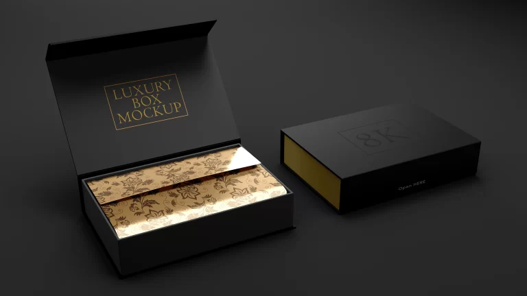
It’s the final 5% of the work, but it makes 90% of the difference. When you present this kind of work, consider using a realistic setting. That’s why I create resources like my Luxury Box Mockup Template. It provides the perfect, professionally lit environment to make tactile designs feel truly tangible.
What I’d Actually Do
- Go Physical First: Before you even open Photoshop, find real-world examples. How does light hit embossed paper? What does worn metal actually look like up close? Your eyes are your best research tool.
- Build, Don’t Decorate: Think of yourself as a sculptor, not a decorator. You are building form and dimension, layer by layer. Each effect should have a purpose that supports the illusion of physicality.
- Subtlety is Strength: The goal is for the viewer to *feel* the texture, not to see the filter. If the effect screams ‘Photoshop!’, dial it back by 30%. The most convincing effects are often the ones you don’t consciously notice.
Stop chasing the flat, minimalist trend that’s draining the soul from our work. Put some grit, some grain, and some life back into your typography. Make something that doesn’t just speak, but can also be felt.
Frequently Asked Questions
What’s the best blending mode for applying textures to type?
There’s no single ‘best’ one. I often start with Overlay for contrast, Multiply for darkening and integrating, and Soft Light for subtlety. The right choice depends entirely on your texture’s brightness and your base type color.
Can I create tactile typography in Figma or Canva?
You can do basic texture overlays and drop shadows in those tools, but you’ll lack the advanced controls for realistic effects. The powerhouse techniques, especially displacement maps and complex layer styles, are really the domain of Adobe Photoshop.
Why is a displacement map better than just using the Warp tool?
The Warp tool is for manual, uniform distortion. A displacement map uses the specific grayscale data of a texture to create thousands of micro-distortions across the type, making it look authentically integrated with an uneven surface. It’s procedural, not manual.
Is it better to use a texture image or a procedural texture filter?
Always use a high-quality image of a real texture. Procedural filters like ‘Noise’ or ‘Clouds’ can look synthetic and repetitive. A real photo contains the organic, random imperfections that make a texture believable.
{“@context”: “https://schema.org”, “@type”: “FAQPage”, “mainEntity”: [{“@type”: “Question”, “name”: “What’s the best blending mode for applying textures to type?”, “acceptedAnswer”: {“@type”: “Answer”, “text”: “There’s no single ‘best’ one. I often start with Overlay for contrast, Multiply for darkening and integrating, and Soft Light for subtlety. The right choice depends entirely on your texture’s brightness and your base type color.”}}, {“@type”: “Question”, “name”: “Can I create tactile typography in Figma or Canva?”, “acceptedAnswer”: {“@type”: “Answer”, “text”: “You can do basic texture overlays and drop shadows in those tools, but you’ll lack the advanced controls for realistic effects. The powerhouse techniques, especially displacement maps and complex layer styles, are really the domain of Adobe Photoshop.”}}, {“@type”: “Question”, “name”: “Why is a displacement map better than just using the Warp tool?”, “acceptedAnswer”: {“@type”: “Answer”, “text”: “The Warp tool is for manual, uniform distortion. A displacement map uses the specific grayscale data of a texture to create thousands of micro-distortions across the type, making it look authentically integrated with an uneven surface. It’s procedural, not manual.”}}, {“@type”: “Question”, “name”: “Is it better to use a texture image or a procedural texture filter?”, “acceptedAnswer”: {“@type”: “Answer”, “text”: “Always use a high-quality image of a real texture. Procedural filters like ‘Noise’ or ‘Clouds’ can look synthetic and repetitive. A real photo contains the organic, random imperfections that make a texture believable.”}}]}