The Narrative Power of Color Grading: Elevating Photography from Good to Cinematic
- Sinisa Zec Studio
- No Comments
- Photography, Tutorials & Techniques
That’s the difference between a snapshot and a photograph with intent. Color grading is where you, the artist, step in and infuse the image with emotion, guide the viewer’s eye, and build a world. It’s the final, crucial step in telling your story.
The Short Answer: Cinematic color grading uses specific color palettes and contrast adjustments in post-processing to create a cohesive mood and narrative. It goes beyond technical correction to intentionally shape the viewer’s emotional response to a photograph.
Correction vs. Grading: Know The Difference
Let’s get this straight first. Color correction is science. It’s about achieving a neutral, true-to-life baseline. You’re fixing white balance, setting black and white points, and ensuring skin tones look accurate. It’s a technical, non-negotiable step. My years in a print shop taught me this the hard way—if your colors aren’t right at the base, everything that follows is built on a lie, and the final print will show it.
Color grading is art. It’s what you do *after* correction. It’s the deliberate process of shifting colors to create a specific feel. It’s pushing the blues in the shadows to evoke coldness or adding warmth to the highlights to suggest nostalgia. One is about accuracy; the other is about intent.
The Mandatory Flaw: When I Pushed It Too Far
Early in my career, I was hired for a series of corporate headshots. I was obsessed with a desaturated, high-contrast cinematic look I’d seen in a film. So, after nailing the lighting in-camera with my Godox strobes, I took the files into Lightroom and went to town. I crushed the blacks, pushed cool tones into the shadows, and desaturated the skin tones. I thought they looked incredibly stylized and cool.
The client’s feedback was brutal and humbling: “The photos are sharp, but our people look… dead. They don’t look like themselves.” I’d been so focused on creating a *style* that I completely ignored the *subject*. I had to re-edit the entire set, focusing on clean, natural colors that made the individuals look healthy and approachable. It was a costly lesson in time and ego, but it taught me that color must serve the story, not overpower it.
Step 1: The Foundation – Neutral Correction
Before you can get creative, you need a perfect canvas. In Lightroom or Photoshop’s Camera Raw, your first job is to neutralize the image. Don’t skip this.
- White Balance: Use the eyedropper tool on a neutral gray or white area. Get this right, and you’re halfway there. The color science in my Nikon Z6 III gives me a fantastic starting point, but every light source is different.
- Exposure & Contrast: Adjust the main sliders to get a balanced exposure. Your histogram should be full without clipping the highlights or crushing the blacks. At this stage, you want information, not a final look.
- Lens Corrections: Check the box. Remove distortion and vignetting. You can add a creative vignette back in later, but start clean.
Step 2: The Tone Curve – Your Master Tool for Contrast and Color
The Tone Curve is the single most powerful tool for cinematic grading. Most people just make a simple S-curve and move on. We’re going deeper.
Instead of just using the main RGB curve, select the individual Red, Green, and Blue channels. This is where the magic happens. Want that popular teal-and-orange look? Go to the Blue channel. Pull the shadows down (adding yellow) and push the highlights up (adding blue). Tiny, subtle adjustments here have a massive impact on the overall mood without looking like a cheap filter.
Step 3: HSL/Color Panel – Targeted Adjustments
The HSL (Hue, Saturation, Luminance) panel is your scalpel. It lets you manipulate individual colors without affecting the rest of the image. This is how you create color separation and guide the eye.
- Hue: Slightly shift the greens toward yellow for a more autumnal, sun-baked feel. Or push them toward blue for a lusher, wetter look.
- Saturation: This is a danger zone. Instead of boosting overall saturation, try *de-saturating* distracting colors. Is a bright red sign pulling focus from your subject? Target the reds and pull their saturation down.
- Luminance: Brighten or darken specific colors. Want your subject’s face to pop? If they are wearing a blue shirt, you can slightly darken the blue’s luminance to create more separation.
Step 4: Color Grading Panel – The Cinematic Finish
This panel, formerly known as Split Toning, is your finishing move. It allows you to add a specific color tint to the shadows, midtones, and highlights separately. This is what unifies the image and sells the cohesive, cinematic world.
A classic approach is to add a cool color (like teal or blue) to the shadows and a complementary warm color (like orange or yellow) to the highlights. This mimics the color contrast we see in countless films and is naturally pleasing to the eye. The key is subtlety. A little goes a long way. Drag the saturation slider for each wheel just enough to introduce the tint, not to paint the image with it.
For a deeper dive into how professional colorists think about these palettes, I highly recommend exploring Adobe’s resources on the Lumetri Color panel, as the principles are identical.
Step 5: Grain and Texture
The final touch for a cinematic feel is often texture. Digital photos can be too clean, too perfect. Adding a small amount of subtle grain can give the image a more organic, filmic quality. It roughs up the edges just enough to make it feel more tangible and less digital. Don’t overdo it—you want to emulate film, not create a sandstorm.
The Bottom Line
- Story First, Style Second. Your color choices must support the emotion and narrative of the photograph. Don’t just apply a look because it’s trendy; ask what the image needs to say.
- Subtlety is Everything. The best color grading is felt, not seen. Drastic, over-the-top effects scream amateur. Master the small, incremental adjustments that build a powerful mood.
- Master the Tools, Don’t Let Them Master You. Presets can be a great starting point, but they are not the destination. Understand the Tone Curve, HSL, and Color Grading panels inside and out. That knowledge is what separates a technician from an artist.
Stop chasing the perfect preset and start learning the language of color. That’s how you develop a signature style. That’s how you create work that holds and lasts.
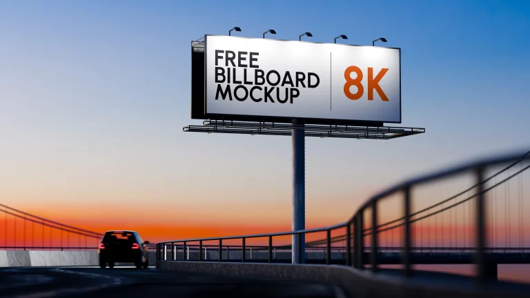
If you’re looking to practice these techniques, you can start by experimenting on some of our high-quality free resources. Try applying a cinematic grade to one of our free 8K billboard mockups and see how it changes the mood of the entire scene.
Frequently Asked Questions
Can I achieve a cinematic look with just a preset?
A preset is a starting point, not a solution. Every photo has unique lighting and color information, so a one-click preset will rarely look perfect. Use them to learn, then build your own grades from scratch for full control.
Do I need an expensive monitor for professional color grading?
You don’t need the most expensive monitor, but you absolutely need a calibrated one. A hardware calibration tool is a crucial investment to ensure the colors you see are the colors everyone else sees.
What’s the biggest mistake beginners make with color grading?
Pushing the saturation slider too far. It’s the fastest way to make an image look cheap and artificial. Focus on using contrast, tone curves, and HSL to create color separation and mood instead.
Should I color grade in Lightroom or Photoshop?
Both use the same Camera Raw engine, so the tools are nearly identical. I recommend doing your primary grading in Lightroom for its workflow efficiency, then moving to Photoshop only if you need advanced masking or local adjustments that Lightroom can’t handle.