The Psychology of Negative Space: Guiding the Viewer's Eye in Complex Compositions
- Sinisa Zec Studio
- No Comments
- Design Theory, Graphic Design
It’s Not What You Put In. It’s What You Leave Out.
Let’s get one thing straight. Negative space is not “empty” space. It’s not the leftover void after you’ve placed all your important elements. If that’s how you see it, you’re missing the single most powerful tool for controlling a viewer’s attention. Negative space is an active, breathing part of your composition. It’s the silence between notes that makes music. It’s the pause that gives a sentence its weight.
For over 15 years, I’ve seen this mistake made by designers and photographers at every level. They cram their frames, desperate to show everything at once. The result is visual noise. The viewer’s eye doesn’t know where to go, so it gives up and goes nowhere. Your message is lost before it’s even heard.
This isn’t about embracing the kind of soulless, sterile minimalism that’s plaguing brand design right now. I’m not advocating for emptiness for its own sake. I’m talking about the intentional, strategic use of space to give your subject power, to create a hierarchy, and to tell a much stronger story.
The Brain on Negative Space: Focus and Breathing Room
Our brains are wired to find patterns and focus on subjects. When you surround a subject (the positive space) with a generous amount of negative space, you’re doing two things psychologically.
First, you’re reducing cognitive load. A cluttered image or layout forces the brain to work overtime just to process what it’s seeing. It’s stressful. A composition with well-managed negative space feels calm, confident, and clear. It gives the viewer’s eye a place to rest, making the message digestible.
Second, you’re creating an undeniable focal point. The negative space acts like a set of invisible arrows all pointing to your subject. Think of classic portraiture by masters like Richard Avedon. He often placed his subjects against a stark white background. There was nowhere else for your eye to go. The emptiness amplified the humanity of the person in the frame. The negative space defined the positive space.
Negative space isn’t an absence. It’s a presence. It has shape, form, and purpose. Your job is to sculpt it as deliberately as you sculpt your subject.
Negative Space in a Designer’s Toolkit
When I started my career on a print-shop floor, this lesson was beaten into me by ink on paper’s unforgiving reality. You learn fast that typography isn’t just about choosing a font. It’s about the space between the letters (kerning), the space between words (tracking), and the space between lines (leading). Get that wrong, and a beautiful brochure becomes an unreadable mess. That space is everything.
In UI/UX and brand design, it’s even more critical.
- Hierarchy and Flow: On a webpage, negative space separates the navigation from the header, the content from the sidebar. It guides the user from one section to the next without them even realizing it. Good UI is often just good management of space.
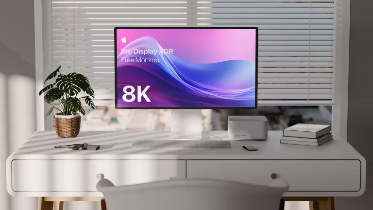
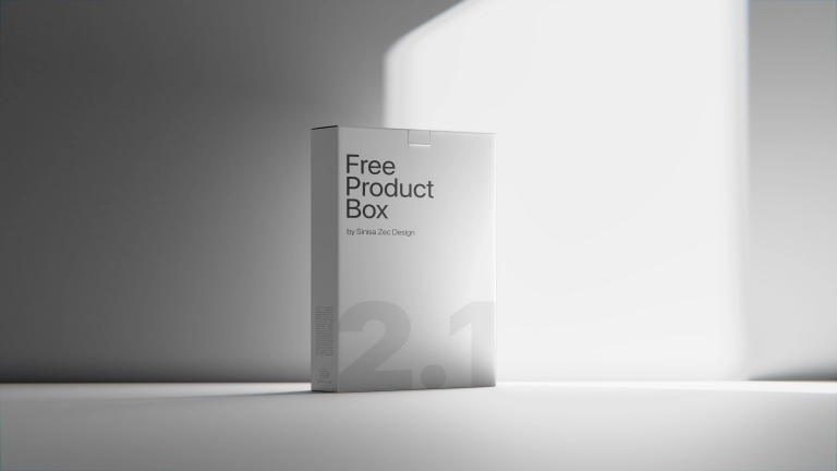
- Perceived Value: Look at any luxury brand. Their packaging, websites, and ads are full of negative space. Why? Because it communicates sophistication and confidence. A crowded layout screams “discount.” A spacious one whispers “premium.” It suggests the product is so good, it doesn’t need to shout. When you’re mocking up a design, like on one of my Luxury Box Mockup Templates, you see this immediately. A simple logo with lots of breathing room looks infinitely more high-end than a box covered in text and graphics.
- Clarity in Complexity: For complex data visualizations or infographics, negative space is what makes the information usable. It groups related items and separates distinct data points, turning a potential chart-disaster into a clear, compelling story.
The Photographer’s Canvas
In photography, we don’t always have the luxury of adding space like a designer. We have to find it, or create it with light and composition. This is where craft separates the pros from the amateurs who just point their camera at something interesting.
When I’m out shooting wildlife with my Sigma 150-600mm, I’m not just looking for the animal. I’m looking for a clean background—a patch of sky, an out-of-focus field—that will serve as negative space to isolate my subject. The lens compression helps create that separation, turning a messy forest into a simple, powerful canvas.
In the studio, I do the opposite. I create negative space out of darkness. With a single Godox AD400Pro and a softbox, I can light my subject precisely and let everything else fall off into complete black. That black isn’t empty; it’s a deep, moody, and intentional environment that forces all attention onto the light I’ve sculpted.
You can also use negative space to convey emotion and scale. Placing a small figure in a vast, empty landscape creates a sense of loneliness or awe. Using a wide-angle lens, like my Sigma 24mm f/1.4, can exaggerate this effect, making the negative space an overwhelming character in the story.
Active vs. Passive Space
Not all negative space is created equal. Understanding the difference between active and passive space is key to mastering its use.
- Passive Negative Space is typically symmetrical and uniform. It creates a feeling of calm, stability, and elegance. Think of a product shot perfectly centered in the frame.
- Active Negative Space is asymmetrical and often creates tension or dynamism. When you place a subject far off to one side, the large, unbalanced area of negative space becomes active. It can create a sense of movement (if the subject is looking or moving into the space) or a feeling of unease (if their back is to it).
Learning to use both allows you to control the emotional tone of your work with precision. It’s not just about what the viewer sees, but how they *feel* when they see it.
The Bottom Line
- Negative space is an active element, not a void. Treat it with the same intention you give your subject. Its shape and volume are critical parts of your composition.
- It directs focus and creates emotion. Use it to reduce clutter, establish a clear focal point, and build a specific mood, whether that’s luxury, loneliness, or calm.
- Mastering it separates professionals from amateurs. Anyone can fill a frame. Knowing what to leave out, and why, is a sign of true confidence and skill in your craft.
Stop filling space. Start designing it. Your work will speak louder, hold attention, and stick in memory.
Frequently Asked Questions
What’s the difference between negative space and white space?
They’re often used interchangeably, but ‘white space’ is a term from graphic design referring to any unmarked area, regardless of color. ‘Negative space’ is a broader compositional term used in all visual arts, referring to the space around and between subjects.
How much negative space is too much?
There’s no magic formula. It becomes ‘too much’ when the subject feels lost or disconnected from the composition, or when the negative space no longer serves a purpose and just feels empty. The key is intent; if the space has a reason to be there, it’s probably the right amount.
Can negative space be a color other than white?
Absolutely. Negative space can be any color, a pattern, or even a blurred photographic background. It is defined by its relationship to the subject (the positive space), not by its own color or texture.