From Pixel to Print: The Renaissance of High-Quality Print Design in a Digital Age
- Sinisa Zec Studio
- No Comments
- Graphic Design, Graphic Design as Art form
I started my career on the floor of a large-scale print shop. For three years, I smelled the ink, felt the rumble of the presses, and learned design from the unforgiving reality of production. There’s no Command-Z when a thousand brochures are printed with a typo. That experience—the permanence of it all—never left me.
Today, everyone is obsessed with the digital. The feed. The fleeting impression. Brands are stripping themselves down to the bone, chasing a soulless, minimalist aesthetic that looks identical to everyone else’s. They believe a clean website and a few social media posts are the entirety of a brand experience. They are wrong.
In this rush to digital, we’ve forgotten something fundamental. We’ve forgotten the power of touch.
The Weight of Reality
A pixel has no weight. A well-designed business card does. A social media post is forgotten in seconds. A beautifully crafted package is kept, reused, and remembered. This is the renaissance of print. It’s not about rejecting digital; it’s about understanding where digital falls short.
High-quality print has become a quiet rebellion against the noise. It’s a signal of intent, a mark of quality. When a startup client comes to me, of course we build them a high-converting website. But when they want to make a real impact, to show their investors or first customers that they are serious, we talk about print. We talk about the physical artifact.
In an age of digital noise, a physical object is a statement. It says, ‘We invested in this. We believe in this. This is real.’ It cuts through the clutter because it exists in the same physical space you do.
The Designer’s Toolkit for Tactility
Designing for print isn’t just about sending a PDF to a printer. It’s about orchestrating a sensory experience. This is where craft comes back into the conversation. It starts long before you open Adobe Illustrator.
Paper is the Foundation
Don’t just pick ‘card stock.’ Paper is the skin of your design. Its weight, texture, and color set the entire tone. Is your brand earthy and organic? An uncoated, textured, or recycled stock communicates that instantly. Is it a luxury tech product? A heavy, smooth, soft-touch laminated stock feels sophisticated and modern.
Paper weight, measured in GSM (grams per square meter), is about presence. A flimsy 150 GSM business card feels cheap. A 400 GSM or even a duplexed 800 GSM card feels substantial. It has authority. It’s a simple choice that changes the entire perception of the object before a single word is read.
Finishing is the Final Word
This is where the magic happens. Finishing techniques are what separate forgettable print from pieces that people treasure. They engage the sense of touch and sight in ways a screen never can.
- Embossing & Debossing: Embossing raises a surface, while debossing presses it down. A debossed logo on a thick cotton paper is the definition of quiet confidence. It invites you to run your thumb over it. It’s a subtle detail that screams quality.
- Foil Stamping: Applying metallic or pigmented foil to paper with heat and pressure. It adds a flash of light and luxury. It’s not just about gold and silver; matte foils, holographic foils, and colored foils can create incredible effects.
- Spot UV: Applying a high-gloss varnish to specific areas of the design. Imagine a matte black business card with a logo that gleams in super-gloss. It creates a contrast in texture that’s both visible and tactile.
- Die-Cutting: Cutting the paper into custom shapes. It breaks the rectangle’s tyranny and can turn a simple brochure into a memorable, interactive object.
These aren’t just decorative elements. They are strategic choices. They add cost, yes, but they also add immense perceived value. They force the designer to be intentional. You can’t just slap a deboss on everything. You have to consider what part of your message deserves that emphasis.
From My Studio: The Mindset Shift
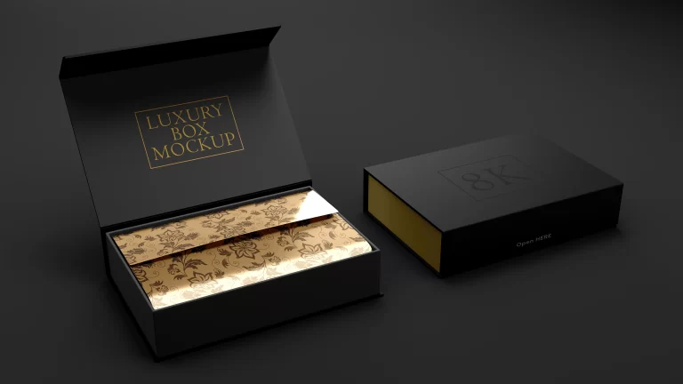
When I design packaging for a new product, I don’t just work in Illustrator. I spend a lot of time with mockups. For a recent project with a startup selling high-end audio equipment, we didn’t finalize the design on-screen. I used one of my own templates, like this Luxury Box Mockup, to show them exactly how the silver foil would catch the light on the matte black stock. We could see the vision before committing thousands of dollars to production. It bridges the gap between the pixel and the physical reality.
This is the discipline that print forces on you. You have to think about ink bleed, color profiles (CMYK vs. spot Pantone colors), crop marks, and safe zones. You have to get it right. My years in the print shop taught me that you design for the final product, not for your screen. It’s a level of rigor that, frankly, has gotten lazy in the digital-only world.
What I design speaks. What I photograph holds. What I create lasts. That motto is the core of my studio, and nowhere is it more true than in print. A file can be deleted. A website can be redesigned overnight. But a beautifully printed book, a thoughtfully packaged product, or a substantial business card has a permanence. It’s an anchor for a brand in the real world.
Stop designing things to be scrolled past. Start creating artifacts to be held.
The Bottom Line
- In a world saturated with digital content, a high-quality physical object has more power and permanence than ever before. It signals investment and seriousness.
- Print design is a sensory experience. Paper choice, weight, and texture are as foundational to the message as the typography and layout.
- Finishing techniques like embossing, foil stamping, and spot UV are not decorations; they are strategic tools to create tactile interest and elevate perceived value.
Photo by engin akyurt on Unsplash.
Frequently Asked Questions
Is high-quality print design significantly more expensive than digital assets?
Yes, the initial unit cost is higher due to materials and production setup. However, its longevity and impact can provide a far greater return on investment by creating a lasting brand impression that digital ads often fail to achieve.
What is the most common mistake designers make when preparing files for print?
Ignoring the technical realities. The biggest errors I see are designing in RGB instead of CMYK, forgetting to include bleed, and using low-resolution images. These are rookie mistakes that my time in a print shop taught me to spot from a mile away.
How do I choose the right paper for my project?
Start with your brand’s personality, not just the budget. A luxury brand needs a heavy, tactile stock, while an eco-conscious brand should use recycled, uncoated paper. Always ask your printer for a sample book to feel the options yourself.