The Power of the Vignette: When to Embrace and When to Avoid a Classic Effect
- Sinisa Zec Studio
- No Comments
- Photography, Tutorials & Techniques
Most vignettes I see are just bad. They’re lazy. A dark, muddy ring slapped on an image in post-production, a relic of early Instagram filters that should have stayed in 2012. It’s often a crutch for a weak composition, a desperate attempt to add “mood” where none exists. And it’s killing otherwise decent photographs.
TL;DR
A good vignette is one you feel, not one you see. Use it with extreme subtlety to guide the eye toward your subject and enhance an existing mood. Avoid heavy, artificial vignettes that look like a cheap filter, especially in commercial, landscape, or high-key photography.
The Two Kinds of Vignette: Optical vs. Artificial
Before we talk about intent, we have to understand the source. Not all vignettes are created equal. One is a beautiful flaw of physics; the other is a line of code.
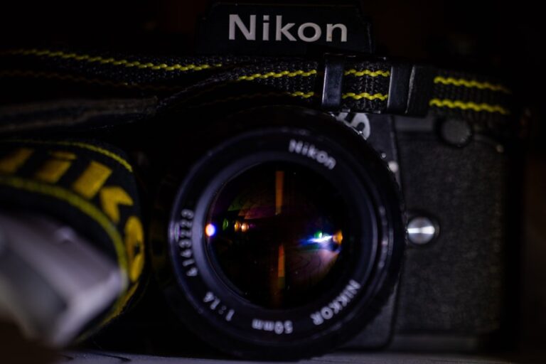
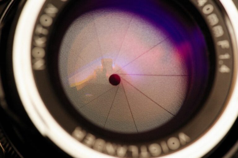
First, you have optical vignetting. This is the real deal. It’s the natural falloff of light toward the edges of the frame caused by the physical construction of a lens. It’s most pronounced when you’re shooting with a prime lens at its widest aperture. My Sigma 24mm f/1.4 Art is a perfect example; at f/1.4, the corners are naturally a touch darker than the center. It’s not a defect; it’s character. It’s the glass itself shaping the light, and it often adds a beautiful, organic focus to the center of the frame without you having to do a thing.
Then you have post-processing vignetting. This is the slider in Lightroom, the filter in Photoshop, the effect you add deliberately after the shot has been taken. This is our tool, and this is where the discipline comes in. Because it’s so easy to apply, it’s even easier to overdo.
When to Embrace the Vignette: The Only Times It Works
I don’t hate the vignette effect. I hate its misuse. In the right hands, applied with purpose, it’s a powerful tool. Here are the only times I’ll consider adding one.
1. To Subtly Direct the Viewer’s Eye
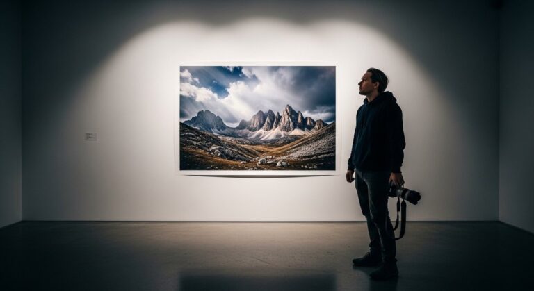
This is its primary, and best, purpose. Our eyes are naturally drawn to the brightest part of an image. A whisper-subtle darkening of the corners and edges can create a subconscious tunnel that leads the viewer directly to your subject. It’s particularly effective in portraiture, where you want all attention on the person, not on a distracting bright spot in the background. The key is subtlety. The viewer shouldn’t notice the frame is darker; they should just find their eyes resting exactly where you want them to.
2. To Enhance Mood and Atmosphere
My personal style leans toward dark and moody. A gentle vignette can support that aesthetic. It can create a sense of intimacy, drama, or introspection by closing the world in slightly around the subject. It’s not *creating* the mood—the lighting, composition, and subject have to do that heavy lifting. The vignette is just the final 5% of polish, enhancing a feeling that’s already there.
A vignette should be invisible infrastructure, not the main attraction. If it’s the first thing you notice about a photo, it has failed.
A Hard Lesson in Heavy-Handed Editing
I learned this the hard way. Early in my career, shooting live concerts in dark venues, I thought a heavy, dark vignette was the epitome of edgy and cool. I’d get back from a show and slap a massive, circular vignette on nearly every shot, thinking it made them look more dramatic. I delivered a set to a band, proud of my “artistic” edits. The feedback was polite but sharp: “We love the energy, but why are the corners of all the photos black? We can’t see the crowd.”
They were right. I hadn’t created drama; I’d just been lazy. I had obscured details, crushed the blacks, and made every photo look the same. It was a template, not a thoughtful edit. That was the last time I ever used a heavy-handed vignette. Lesson learned: your edit should serve the photo, not overpower it.
When to Avoid the Vignette: The Red Flags
Knowing when *not* to use an effect is more important than knowing how to apply it. A premium aesthetic is often about restraint.
In Bright, Airy, or Commercial Work
A vignette is the enemy of a clean, high-key look. If you’re shooting e-commerce products, corporate headshots against a white background, or anything meant to feel bright and optimistic, a vignette is completely counterproductive. Clients pay for edge-to-edge clarity and color accuracy, not muddy corners.
In Most Landscape Photography
You hiked for miles to capture a grand vista. Why would you intentionally darken the edges of that incredible scene? Landscape photography is about celebrating the entire frame. While there might be a rare artistic exception for a moody, focused shot, 99% of the time, a vignette has no place here. It works against the entire goal of the genre.
When It’s a Crutch for Bad Composition
If you’re using a vignette to hide a distracting element in the corner of your frame, stop. Re-compose the shot. Get it right in-camera. Fixing fundamental compositional flaws with a dark blob is a bad habit that will stunt your growth as a photographer. I spent years in a print shop, and I can tell you that shortcuts taken on screen become glaring, expensive mistakes on paper.
And please, just say no to the white vignette. It almost never works and instantly dates your work to a very specific, and not fondly remembered, era of digital photography.
My Approach: The “Feel, Don’t See” Rule
When I do add a vignette, I rarely use the global vignette slider in Lightroom’s Effects panel. It’s too uniform, too perfect. Instead, I’ll use a large, heavily feathered Radial Filter. This allows me to create a more organic shape and position the darkening effect precisely where it’s needed, leaving other parts of the edge untouched.
My settings are minimal. An exposure drop of -0.10 to -0.30 EV is usually more than enough. The acid test is simple: toggle the effect on and off. If the change is a jarring jump, it’s too much. It should be a barely perceptible shift, a nudge that makes the center of the image *feel* a little brighter and more important.
The camera doesn’t make the photograph. Your eye does. And your restraint in post-production is just as important as your vision behind the lens.
The Bottom Line
-
A good vignette is a structural tool to guide the eye, not a decorative effect to add fake mood.
-
Optical vignetting from a great lens is character; an artificial vignette is a choice that demands extreme subtlety.
-
When in doubt, use less. Or better yet, none at all. A strong composition doesn’t need the help.
Frequently Asked Questions
What’s the difference between optical and post-production vignetting?
Optical vignetting is a natural light falloff at the edges of a lens, especially at wide apertures, and is part of the lens’s character. Post-production vignetting is an artificial effect you add later in software like Lightroom or Photoshop.
Can a vignette fix a bad composition?
No. Using a vignette to hide distracting elements is a poor substitute for strong composition. It’s better to get the framing right in-camera rather than trying to patch it with a lazy edit.
Is vignetting ever acceptable in commercial photography?
Rarely. Most commercial work, especially for products or clean corporate branding, demands even lighting and edge-to-edge clarity. A vignette usually works against these goals and can make an image look less professional.