Masterclass: The Revival of Hand-Drawn Elements in Premium Digital Design
- Sinisa Zec Studio
- No Comments
- Graphic Design, Graphic Design as Art form
Look around. So much of modern digital design feels like it was assembled from the same box of generic parts. Perfectly kerned sans-serif fonts, geometric logos, and flat color palettes have created a digital landscape so clean it’s become sterile. It’s safe, it’s scalable, but it has no soul.
Why Everything Started to Look the Same
I think roughly 90% of brands are heading the wrong way. The obsession with minimalism wasn’t entirely wrong-headed; it was a reaction against the cluttered design of the early web. The problem is, we overcorrected. We stripped away so much character that we were left with nothing but a clean, empty shell. It’s the visual equivalent of a hospital room.
This was fueled by the rise of design templates, UI kits, and stock asset libraries. They promised efficiency, and they delivered. But they also created a generation of designers who assemble rather than create. The result is a massive visual monoculture where distinction is the exception, not the rule. It’s easy, it’s fast, and it’s utterly forgettable.
When I started out on the floor of a print shop, you learned that design had a physical reality. You felt the texture of the paper, the slight bleed of the ink. Those imperfections gave the work life. We’ve lost that connection in the purely digital space, and audiences can feel it, even if they can’t articulate why a brand feels cold and distant.
The Imperfect Mark of Authenticity
This is where the hand-drawn element comes in. A line drawn by a human hand is never perfectly straight. A letterform sketched with a pen has variations in weight and texture. These are not flaws; they are proof of life. They are a direct signal to the viewer that a real person, with a real point of view, was behind this work.
In a world saturated with pixel-perfect vectors and AI-generated imagery, the imperfect, organic line has become a premium feature. It’s a mark of bespoke quality.
Think of it like this: anyone can buy a mass-produced piece of furniture. It’s functional, but it has no story. A handcrafted wooden table, with its unique grain and tool marks, is a different thing entirely. It holds the story of its creation. Hand-drawn elements do the same for a brand. They add warmth, character, and a narrative that sets the work apart from the noise.
Bringing the Hand-Drawn to the Digital Canvas
This isn’t about making your design look messy or unprofessional. It’s about strategic integration. The process is simpler than you might think, and it doesn’t require you to be a master illustrator like one of the old masters. Your unique hand is the point.
My process usually starts with pen and paper. Just sketching ideas, letters, icons. Once I have something I like, I’ll either scan it at a high resolution or just take a clean photo of it. From there, it goes into Adobe Illustrator. While the Image Trace tool can be a quick starting point, I almost always re-draw the element manually with the Pen tool. This gives me complete control over the final vector, allowing me to clean it up just enough while preserving the original’s organic feel. A good tablet, like those from Wacom, is invaluable for this, as it allows for a more natural drawing motion directly on the screen.
I learned this lesson the hard way early in my career. I was working on a brand that wanted an “artisanal” feel. To save time, I used a pre-made script font. The client immediately rejected it, saying it “looked fake.” They were right. I went back, hand-lettered their name, digitized it properly, and it was approved on the spot. You cannot shortcut authenticity.
Strategic Use Cases for Hand-Drawn Elements
Don’t just throw hand-drawn scribbles everywhere. The power is in the contrast between the clean, structured digital layout and the organic, human element. It creates a focal point and injects personality where it’s needed most.
Here are a few places I find it works best:
- Logos & Wordmarks: A fully or partially hand-drawn logo is the ultimate statement of a brand’s unique identity. It’s ownable in a way a geometric shape and a sans-serif font never will be.
- Spot Illustrations & Icons: Instead of grabbing another icon from a generic set, a few custom-drawn illustrations on a website can completely change the tone, making it more approachable and engaging.
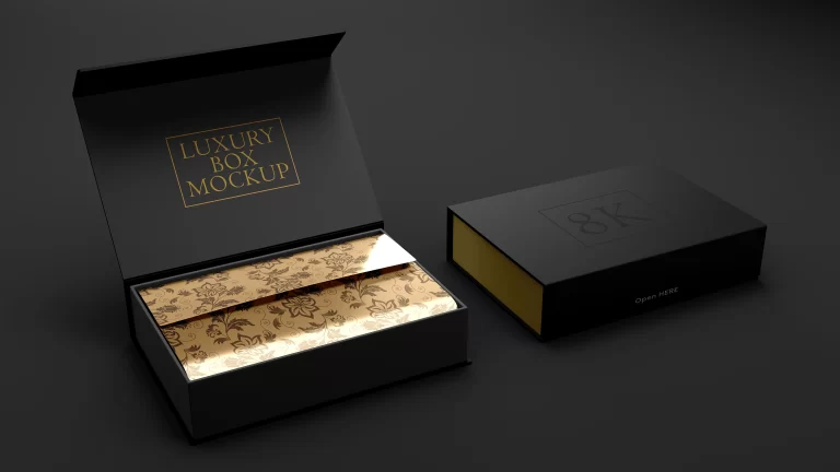
- Packaging & Patterns: A repeating pattern created from a hand-drawn element can make packaging feel special and tactile, even before the customer touches it. You can see how this would play out on something like this Stationery Branding and Identity mockup. The organic touch transforms a simple box or card into a piece of art.
- Signatures & Accents: A simple hand-drawn underline, circle, or arrow can break the monotony of a corporate presentation or website, drawing the eye and adding a touch of personality.
What I design speaks. What I photograph holds. What I create lasts. The goal is to create something that lasts, and sterile trends don’t last. Human character does.
The Bottom Line
- Perfection is Boring: The relentless pursuit of pixel-perfect minimalism has made countless brands generic and forgettable. True distinction comes from character, not from flawless execution.
- The Human Hand is a Premium Tool: In an age of automation and templates, a hand-drawn mark signifies bespoke quality and authenticity. It tells a story that stock assets never can.
- Strategy Over Decoration: Use hand-drawn elements with intention. Their power lies in the contrast with clean digital layouts. Use them to inject personality and create focus, not to create chaos.
Frequently Asked Questions
Do I need to be a great artist to use hand-drawn elements?
No. The goal is authenticity, not artistic perfection. Simple, confident lines and unique lettering drawn in your own style are more effective than a technically perfect but soulless illustration.
What’s the best way to digitize a drawing for design work?
Scan your drawing at a high resolution (at least 300 dpi) or take a well-lit photo. Then, bring it into Adobe Illustrator and manually trace it with the Pen tool to create a clean, scalable vector that retains the original’s character.
Won’t hand-drawn elements make my brand look unprofessional or childish?
Not if used strategically. The key is contrast. When you pair a sophisticated, clean layout with a thoughtful, well-executed hand-drawn element, it reads as confident and bespoke, not amateurish.
You might also like
related articles

-
Post Views: 37

-
Post Views: 23

-
Post Views: 18

-
Post Views: 9